The Format of the Century

The slideshow, a cornerstone of contemporary teaching and presentations, indeed stands as the format of choice across countless domains in this century. However, the journey to its current status is rooted in a rich history of technological innovation and educational evolution.
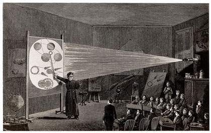
For those with an interest in the history of image-making, the magic lantern is recognized as a pivotal precursor to cinema. In the mid-19th century, the transition from hand-painted glass slides to photographs marked a significant evolution for the magic lantern as a projection device. This period saw a renaissance in its use, enabling a broader array of images to be projected more convincingly and vividly than ever before.

In the mid-19th century, the advent of photography began to replace hand-painted glass slides, heralding a renaissance for the magic lantern as a projection device. This transformation allowed for a wider variety of images to be projected more convincingly and vividly, enhancing the device’s utility and appeal.

During this period, the magic lantern began to embrace a new role beyond entertainment, emerging as a valuable pedagogical tool. This shift was particularly impactful in the realm of art history education, where the enhanced capability to project detailed images served as a revolutionary way to examine and discuss artworks in depth.
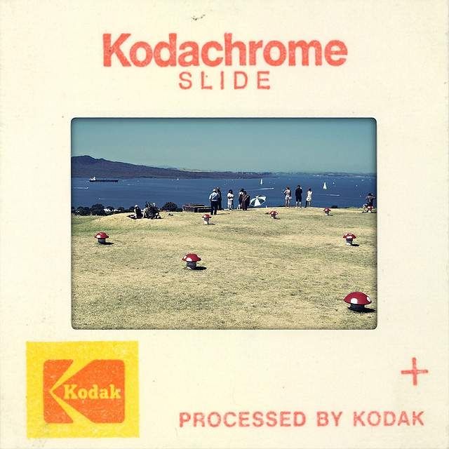
Image label
In 1935, Kodak revolutionized image projection with the introduction of Kodachrome, a process that created reversal film on a transparent base. This innovation made it feasible for anyone to display their photographs through a projector, like the iconic carousel slide projector. This advancement democratized the sharing of visual stories, significantly impacting how images were presented and viewed.
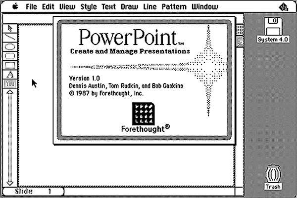
Image label
Fast forward to the 1980s, a small company named Forethought developed a groundbreaking product known as “Presenter.” This software would later be acquired by Microsoft, marking a pivotal moment in the evolution of presentation technology.
Since then, presentation software has become a pervasive communicative medium. Everybody has discovered a need to present something. As a result, the market has grown significantly. There are the big three: Microsoft Powerpoint, Apple’s Keynote, and Google Slides. And there are many low entrance options here aiming at making the task easier for non-pro uses such as kids.
All these tools (and a million others) share one same set of ideas, which I call the paradigm of slide-oriented presentation.
Law of slideshow
Information is to be presented on a fixed sized area called slide.
A presentation may contain a number of slides arranged in a set order.
Each slide may contain text, image, animation, audio and video.
You can also have between-slide transitions.
circa AD 2022
In the eLearning development sphere, major platforms like Articulate Storyline, Adobe Captivate, and Trivantis Lectora have built upon the foundational paradigm established by tools like PowerPoint. They’ve introduced several key features that enhance interactivity and engagement, including Timelines for sequencing content, Layers for depth in presentation, States for dynamic content changes, Triggers for interactive actions, and Variables for customized learning paths.
Despite these advancements, at their core, these platforms maintain the traditional slide-based approach to presentation and learning content delivery. They enrich the model without straying from the fundamental concept of guiding learners through a structured series of information and activities.
Slides, benefits and banes
Think of an online course you recently took or authored, was it in the slide format, or in the scroll format?
At first glance, this inquiry might seem weird.
Many instructional designers, and by extension learners, often unconsciously adhere to what’s familiar. This phenomenon illustrates how our choices and creativity can be limited by the tools at our disposal—a classic example of thinking constrained by the tools that we use.
Our selection of tools isn’t always a matter of deliberate choice. More often than not, decisions are influenced by external factors or anecdotal evidence suggesting the suitability of a particular tool, without a comprehensive evaluation of all options.
For instance, if you’re working with platforms like Articulate Storyline, Adobe Captivate, or Trivantis Lectora, you’re inherently committed to producing slide-based eLearning. Conversely, if these tools are not in your toolkit, you’re likely leaning towards scroll-based eLearning.
Given that these three platforms are considered “premium,” it’s easy to fall into the trap of believing that slide-based eLearning is inherently superior or more desirable.
However, this assumption merits closer scrutiny. The slide-based approach is not unequivocally more effective; it’s crucial to recognize both its benefits and limitations.
On the plus side, slides offer the ability to layer content, adding depth and dimension to the learning experience. They support a layer of coding that enables the customization of variables, object states, and trigger-based actions—capabilities reminiscent of PowerPoint. The unique addition of a timeline, where objects can animate or transform, elevates a simple slideshow into a dynamic eLearning authoring environment.
However, the Achilles’ heel of slide-based content is its lack of responsiveness. While Adobe has made strides towards resolving this with the introduction of fluid boxes, achieving the seamless adaptability inherent in scroll-based authoring tools still poses a significant challenge. This highlights the need for a balanced evaluation of both formats, considering their respective strengths and challenges to optimally leverage the chosen tool for effective eLearning development.
From PPT to self-paced course
You already have a PowerPoint…
Many eLearning projects begin with the intention of digitalizing traditional training methods, often attempting to convert PowerPoint presentations into formats that are accessible online. This transformation process typically sees the slides being showcased sequentially, accompanied by a voiceover narration. Users are then prompted to click ’next’ to advance, embodying the essence of what is commonly referred to as a “page-turner.”
The HIPAA training exemplifies the quintessential page-turner format. For many years, the so-called training is nothing more than an all-text legal document presented in consecutive pages with a two navigational buttons. Learners are guided through dense legal jargon with minimal interaction or engagement, a method that prioritizes compliance delivery over knowledge comprehension or application.
HIPAA Training circa 2017
While this approach is widespread, particularly in areas like compliance training where the primary goal is to mitigate liability rather than to maximize learning efficacy, it fundamentally lacks in engaging the learner or fostering meaningful understanding.
The challenge of transcending the page-turner model is significant. It’s rooted in the difficult task of integrating the nuanced and irreplaceable dynamics of human interaction into digital learning platforms, suggesting a need for more innovative and engaging instructional strategies.
A classroom without teacher
The problem is that it is really hard to replace the human instructor. A voiceover can help, but it doesn’t have the presence (look, it is a person) and credibility (“this person knows the stuff”), the kind of invitational interactivity (“ask me a question”), and finally, the flexibility in administering the content (“let me explain this in a different way”).
In contrast to a human presence, and all the interactivity afforded by such presence, elearning with slides, VOs, and next buttons are cold and tedious. They are just information without the proper experience that wraps around it. Think about Apple events without a presenter on the stage, just a machine voice being broadcasted from backstage! And click next after each sentence!
While a good presenter can talk over one line of text or one single image on the screen for over a long period of time without losing engagement, the same text or image cannot hold for the self-paced learner’s attention for that long. In fact, to let the visual remain static over 30 seconds in such a context is already challenging.
This is the reason why numerous have resorted to having a human character (in the form of a cutout figure) which, although not adding any instructional information, helps to overcome the inhumane abyss.
But this is a reality of elearning production many of us have to face.
Any Tips?
The answer is yes. However, it takes effort. It takes more than adding a few buttons here and there and demand learners to click. We will discuss these non-productive interactivity later, in a different chapter.
The truth is, we need to rethink the content and how they are organized. In choosing what to display on a slide, SMEs often fail to take into consideration of the fact that lack of immersion needs additional compensation for what could be working. In other words, a slide full of bullets points of long sentences should be split into smaller pieces of information for easier reading and understanding.
Ideally, one slide should focus on only ONE learning point. What is the takeaway of this slide? If after viewing it, the learner cannot summarize it in one sentence, then the slide may have presented too much information. This summarization is a micro-learning unit, and a self-paced course is therefore a chaining of such micro-learning points into somewhat larger points which are often referred to as the learning objectives.
Ultimately, what is the best way to organize content and split when necessary requires good understanding of the subject matter as well as of how people learn.
Case study - Affordable Interactivity
In this case study, we are looking at a typical powerpoint conversion project: a dermatologist giving a lecture about some key issues regarding the patch test method.
In this case study, we delve into a common scenario: transforming a PowerPoint presentation by a dermatologist on the patch test method into an engaging eLearning module. To achieve this, a couple of strategic steps are proposed:
1. Design Consistent Layouts: The initial task involves organizing the provided text and images cohesively. A well-thought-out layout design is crucial here; however, it doesn’t need to be overly elaborate. The key is to strike a balance, ensuring the graphics are appropriate for the subject matter without becoming distractions. In different academic or professional realms, the threshold for what’s considered engaging versus distracting can vary significantly.
2. Incorporate Meaningful & Affordable Interactivity: Moving beyond the static nature of traditional slides, it’s essential to weave in interactive elements. Yet, the goal isn’t to inundate learners with constant prompts for clicks, which can quickly become monotonous. Each interactive opportunity should feel relevant and valuable from the learner’s perspective, thereby fostering genuine engagement. This approach requires careful consideration of the utility and purpose behind each interaction, ensuring it contributes positively to the learning experience.

A simple case of interactivity:
the grading system is first presented linearly, as in the original slide, then the learner is given the opportunity to revisit each category to reinforce learning.
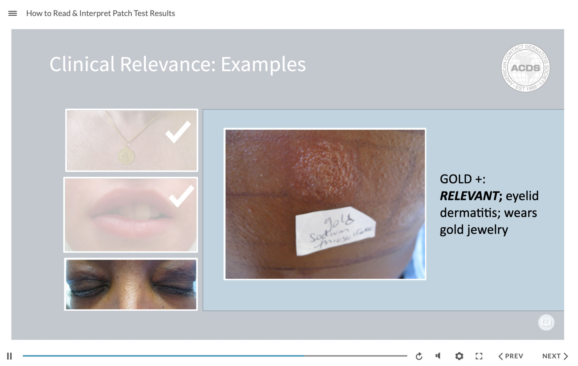
Another simple case of interactivity:
for better understanding of what constitutes clinical relevance, we invite the learners to investigate some actual examples.
The final step is to see how to shape the structure of the lecture in a different way that is more conducive to learning. The original slides are, of course, completely linear. And sometimes this is completely fine. However, we can also identify opportunities for branching. This happens several times in this project.
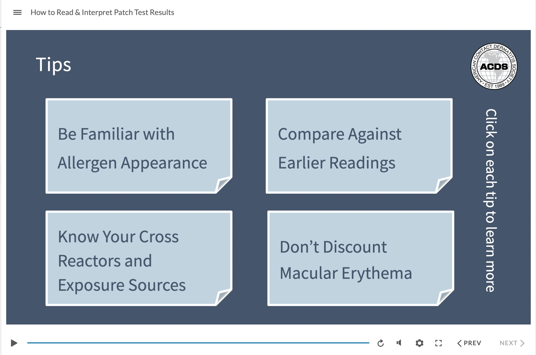
A simple case of branching:
here are some tips! Instead of presenting these one after another, we want to give an overview of the deck of tips that are at learner’s disposal, and let them choose which one to proceed first.
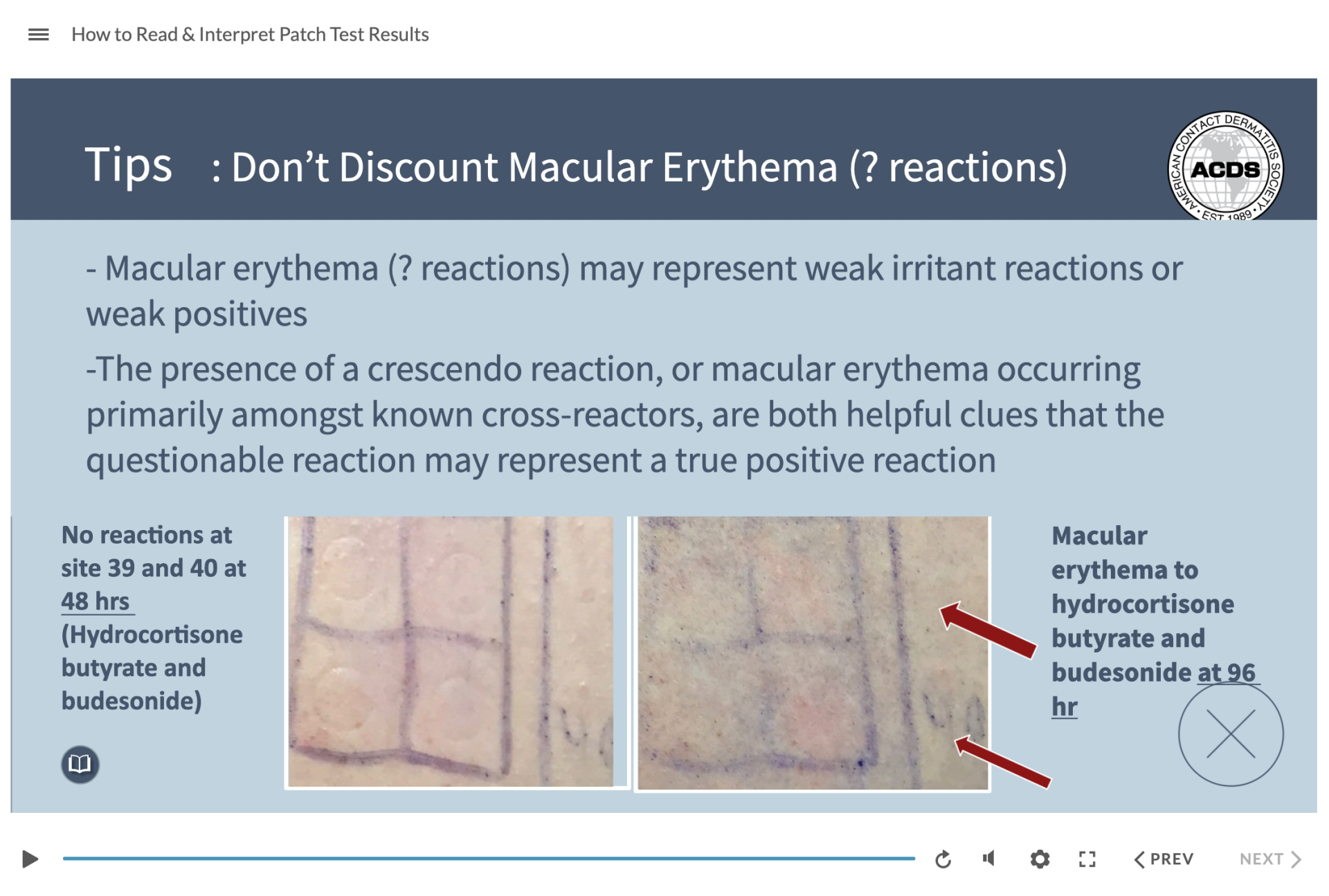
Clicking on any of the tip card will bring up the tip, which may contain tons of materials in itself. After you are done with the tip, click on the close button to return to the tips panels. These interactions are meaningful as they allow learners to exercise their freedom of choice.