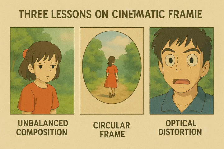
Three Lessons on Cinematic Framing
 Ida, I’m not Madame Bovary, The Favorite
Introduction
In all film schools and textbooks, a shot (unit of filmmaking) has two important quantifiable dimensions: scale and duration. The scale can range from extreme long shot to extreme closeups. In other languages this terminology is slightly different (e.g., in French the closeup is gros plan, translating a degree of proximity to a degree of size).

This system works well most of the time, but it does present problems whenever two characters of radically different distances are presented to the camera. This famous scene in Citizen Kane, for example, divides characters into three groups, each of which is on a different scale: VLS, MLS, MCU. It is hard to say what scale this shot is, because all of them are psychologically important.

Of course, there are also numerous shots in almost any film where no human is presented. What would be the scale of these shots?

For students who have to deal with a shot analysis assignment, a decision has to be made. And there is one reasonable strategy: we could determine the scale of an empty shot by imaging the presence of a human figure. We would have to rely on our perception of the size of objects we recognize — such as the TV box, rice cooker etc., unless somebody made a joke on us (see the following image).


A Framing Lesson from Ida
I hope the above discussion establishes that the so-called shot scale, or our intentional framing strategy, is guided by human figure presence. For this very reason, if an image contains more than one human figure, it has to be composed according to their heroic status. Look at any film poster, you will instantly know who is the hero, and how big a star he/she is!
A recent film, Ida(2013), systematically challenges what we normally take as good framing. It uses a framing strategy that is clearly imbalanced and intentionally evokes discomfort. This strategy applies to the majority of the film except the last thirty minutes, where its framing goes back to “conventional”.
“Ida” is a poignant Polish film directed by Paweł Pawlikowski, set in 1962. It follows the journey of Anna, a young Catholic nun preparing to take her vows, who discovers she has a Jewish heritage. Before she commits to her religious life, she embarks on a road trip with her estranged aunt, Wanda, to uncover the truth about her family’s past during World War II. As they delve into the haunting memories of loss and identity, Anna, who adopts the name Ida, grapples with her faith and the legacy of trauma, leading to profound revelations about her lineage and the choices that define her future. The film is remarkable for its striking black-and-white cinematography (not many of these every year) and exploration of framing strategies to convey the inner imbalanced world of our heroine.


These instances are far from unique. Viewed conventionally, such framing might seem startlingly inept – the kind of composition guaranteed to make a seasoned cinematographer politely, but firmly, decline the job, lest it tarnish their reputation. Certainly, within the polished aesthetics of a Marvel epic, these choices would be unequivocally labelled ‘bad’. But in the distinct world of this film, such apparent flaws are intentional. The heroine’s visually awkward placement isn’t poor execution; it’s the precise external manifestation of her inner turmoil.
These shots vividly demonstrate how real formal innovation sparks in cinema and media alike: through the intentional disruption of the familiar, a disruption that, critically, serves a distinct purpose. This exposes a common frustration with mainstream Hollywood: its perceived aversion to truly challenging viewers, to nudging them beyond established aesthetic and moral comfort zones. By framing characters unconventionally, the filmmaker reveals how certain norms, ingrained by mass media consumption and perpetuated by the culture industry, can effectively operate as propaganda. While it’s true we often seek psychological reassurance in images, must every single frame be dedicated solely to providing that comfort?
Admittedly, we don’t approach the film expecting its visual eccentricities from the get-go. We naturally anticipate standard narrative conventions and familiar cinematic language, the very foundation that gives subversion its impact. Deviation, after all, only startles because it disrupts the norm; the jolt lands precisely because we expected otherwise. Realizing that the film’s unconventional framing carries weight isn’t immediate – it’s a gradual dawning, a journey of discovery that, personally, makes the viewing experience thoroughly engaging.
This interpretive journey lends the final ten minutes or so their visceral power. After Ida partakes in a conventional suite of worldly—perhaps quintessentially human—pleasures (donning lay clothing, smoking a cigarette, drinking alcohol, sharing intimacy with a man), the cinematography noticeably settles. The framing becomes more traditional, as if human figures are rightfully restored to their central place, lending her world a newfound, if tentative, balance.
As viewers, we’re left with a complex cocktail of feelings. On one hand, there’s a certain relief, a comforting familiarity, in these intimate and compositionally conventional shots—like sinking back into a well-worn armchair. On the other hand, the preceding visual journey has irrevocably heightened our awareness of the harshness beyond the frame, of those lives lived perpetually off-balance.
Ida concludes with its protagonist making her way down a country road. But everything’s changed—same habit, radically different occupant—the filmmaker deploys the trusty handheld camera. It’s a familiar, perhaps famously unsubtle, signal for subjective perspective, underscoring the internal sea-change. Where should Ida go? Back to the cloister, or somewhere entirely new? Her destination remains tantalizingly unclear. What is certain is this: the world is now being witnessed through fiercely human eyes.

That Obscure Object of Circular Frame
When I speak of framing, I mean more than just arranging elements within the shot; it encompasses the deliberate choice of the frame itself. We’ll tackle the nuances of aspect ratios later, but first, let’s venture into a fascinating, perhaps unfamiliar, corner of cinematic history.
My own explorations as a media scholar have led me deep into early cinema, a time when the circular mask enjoyed remarkable prominence. What follows isn’t a definitive taxonomy of the “iris shot,” as it’s known, but a glimpse into its versatility. The iris could manifest as a sharply defined circle standing boldly within the rectangular frame, as seen here:

Alternatively, it might appear as a circle with feathered boudary, functioning as a particularly emphatic form of vignetting:

Abel Gance, in his visionary La Roue (1923), elevated the iris mask to a core formal device. Its circular form, echoing the titular “wheel,” permeates the film’s visual language. Witness the famous train crash sequence: notice how the iris itself seems to wrestle against, almost shatter, the rigid geometry of the rectangular frame!
Since the arrival of sound and its remarkable ability to enhance realism, the use of the iris in cinema has taken a backseat. Nowadays, films are often viewed as windows into a vibrant three-dimensional audiovisual world. In this context, the circular iris can feel a bit intrusive, clashing with the immersive spatial experience we’ve come to expect. As a result, when filmmakers do choose to employ the iris, it often serves as a nostalgic nod to the silent film era, much like the stunning shots found in Guy Maddin’s captivating short films.

But what was it about the iris mask that so enchanted early cinema audiences? I can’t help but wonder if it has something to do with the lasting influence of the magic lantern, the very first medium for projecting images. While pioneers like Lumière and Edison perfected and commercialized moving pictures, they didn’t overshadow the aesthetics of framing that came before them.


If the illustrations above didn’t make it clear enough, what is circular is not the plate itself used by the magic lantern. The circular format was embedded with the wooden slide frame, which was distinctly rectangular! This circular image is a deliberate choice—one that is not only visually appealing but perhaps particularly fitting for portraits.

According to their book Remediation: Understanding New Media by J. David Bolter and Richard A. Grusin, remediation is a defining characteristic of new digital media as digital media constantly remediate its predecessors such as television, radio, print journalism and other forms of old media. However, remediation as a concept can be applied to old media themselves. Cinema was remediating Magic Lantern in this case and Magic Lantern was definitely remediating something else (for instance the tableau tradition in theater, the narrative picture book and the camera obscura setup) before its time. Of all these different traditions, only the camera obscura renders a circular shape.

Indeed, many modern camera obscuras cleverly project their captivating images down from the rooftop onto a convenient viewing table – a design I’ve personally appreciated at marvels like the Griffith Observatory in Los Angeles.


I am not Madam Bovary-an unexpected revival of circular frame
Naturally, the language of cinema itself has undergone quite a metamorphosis since those early days. Vanished are quaint techniques like the iris wipe or the gentle dissolve to black, largely supplanted by the ubiquitous straight cut. To my utter surprise, a recent film revisited this old grammar to somewhat interesting effect.

Apart from its boldly daring critique of the Chinese political climate, the film is remarkably innovative in its exploration of the circular frame. Let me take you through the captivating beginning. The film opens with a completely silent credit sequence, which is quite an unusual choice. But nothing can quite prepare the audience for the first shot, as you can see below, followed by five other similar shots. Each of these frames is entirely static—indeed, they are painted in the tradition of magic lanterns, accompanied by Feng’s off-screen narration.

As if mirroring the transition from hand-painted magic lantern slides to photographic images, the film then presents the next shot, with the voiceover providing a seamless continuity.

In a delightful nod to the showmanship of the first Lumière screening, the static image then comes to life, transforming into a dynamic video sequence!
…
As I mentioned earlier, although the image is in circular format, the widescreen frame still has a strong presence. This presence is accentuated by making characters moving from outside the iris into the iris, such as the following:

The film goes on in this format for about 35 minutes, then something very dramatic happens. To use the shot of going through a channel as a transition device, the film presents three formats in a row: first the circular, then the full wide-screen, and finally settles on the square boundary.
This visual change corresponds to an important narrative event: our heroine finally amasses the courage to take legal action against her persecutor — from now on, she wants to “be square”!
However, the “be square” section doesn’t last very long. 20 minutes later, the screen abruptly switches to the circular frame.

This move is somewhat pre-figured a few minutes earlier in another shot which is somewhat circular. To be precise, this is a “key hole” frame that positions the viewer as a voyeur to the mysterious operations of senior political officials.

Our heroine’s journey reaches another milestone close to 2 hours’ mark, where she emerges from being subdued (in the form of no other than marriage!) to again rebellion. The screen echoes this by going square again.

But this is not the end of it. After her failed suicide attempt, the epilogue section of the film bring back to the audience much waited full wide-screen format. Everything finally goes back to normal, in a highly unrealistic lighting, as if this was only a dream!

Among Chinese filmmakers, Feng isn’t typically celebrated for formal innovations. He doesn’t belong to the 5th or 6th generations that have garnered international acclaim. Rather than catering to film festivals and intellectual tastes, Feng’s work is deeply rooted in the domestic market, connecting with the joys and losses of everyday audiences. I was genuinely surprised to see that, at this late stage in his career, he could pull off something so impressive.
From circular frame to optical distortion
What’s the implication of our discussion on circular framing? As someone who always “digs” the formal devices of cinema, I’m thrilled to see experiments of this sort. However, I recognize that for most moviegoers—especially those familiar with Feng’s purely entertainment-focused blockbusters—this inevitably raises the question: how does this formal device connect to the narrative (or whatever you believe should be a film’s central focus)?
I find it somewhat puzzling that formal devices are expected to “serve” narrative purposes like servants to masters. Nevertheless, I’ll admit that in this particular case, the film’s approach seems less convincing.
Beyond cinematic innovation, I’ve also been contemplating circular framing in photography and videography, especially since I recently began experimenting with a circular fisheye lens.

The circular fisheye lens has long been an intriguing oddity in photography. It offers an incredible field of vision and, thanks to modern computational photography, you can easily “defish” your images in post-processing—even maintaining some artistic distortion if desired. For 360° photographers, it’s remarkably efficient, requiring just four shots to capture an entire sphere!
While most photographers treat the circular fisheye as a fun but cautiously-used accessory, very few venture into shooting video with it. There seems to be an unspoken rule against it, as if it crosses some invisible line of visual acceptability.
But what exactly makes us hesitate? Is it the circular framing, the distortion, or perhaps the unique combination of both?
In this article, I’ve explored the fascinating world of circular framing. I’ve been making the case that this once highly popular mode of image presentation has sadly faded into the background with the emergence of modern technologies like photography and cinema.
Throughout media history, we’ve seen aesthetic choices persist across new platforms (just think about all those menus and clicks in VR!), but sometimes practical limitations gradually phase out certain artistic decisions. Circular framing required that extra step, and let’s face it—it doesn’t make the most efficient use of our precious screen real estate.
Looking at Feng’s work through the perspective of fisheye techniques reveals another interesting aesthetic choice. Feng clearly didn’t shoot his film with a circular fisheye lens! We can conclude that he found circular framing appealing, but deliberately chose to avoid the distortion effect.
And really, what would be the appeal of constant fisheye distortion throughout an entire movie? What purpose would it serve to subject viewers to such intense discomfort? After all, we’re not fish!
It’s a fair point! However, discomfort has historically been a powerful catalyst for media innovation. Many techniques we now consider standard were initially jarring to audiences. Early cinema-goers were startled by straight cuts and medium shots that “dismembered” human bodies. Editing was much slower then, and viewers only gradually adapted to quicker pacing.
So can optical distortion become something we not only tolerate but appreciate? Or is it permanently destined to remain visually taboo?
We won’t know until bold filmmakers experiment with it! Just as visionaries like Terry Gilliam and Stanley Kubrick masterfully employed optical distortions for stylistic effect, these visual “discomforts” can actually strengthen artistic expression. Interestingly, I’ve found no scientific studies on the psychology of shot scale despite extensive research in cognitive film theory.
The absence of compelling circular fisheye videography doesn’t mean it can’t be done effectively. I’d love to challenge film students with this constraint—I’m confident that creative minds would discover fascinating subjects perfectly suited to the circular fisheye perspective!
After having written this I discovered that there is actually a recent film that employs circular fisheye. The film is Lucifer (2014), by Gust van den Berghe, thanks to an excellent post by Luke McKernan. The process is referred to as Tondoscope.
The Favorite, or embracing optical distortion
Filmmakers have traditionally approached fisheye lenses with caution, wary of both their circular frame and the optical distortion they create. While recent films like “I’m Not Madame Bovary” suggest the circular frame might be acceptable, the extreme wide-angle distortion remains a challenging artistic choice for audiences to embrace.
That’s why I was genuinely surprised to discover these distinctive distortions appearing frequently throughout “The Favourite.” These unique shots caught my attention and sparked my curiosity.
What exactly are these distinctive shots, and where do they appear? Do they serve a meaningful narrative purpose? Perhaps they form a deliberate structural pattern? Or is there another artistic intention we haven’t yet recognized? In the following analysis, I’ll document these shots (aiming to be as comprehensive as possible, though I may overlook some examples) and share my thoughts on their potential interpretations.
The first such shot appears about 2 minutes into the film. And it is a panning shot:

As I went in completely blind (I prefer experiencing films without any prior knowledge), an alarm bell immediately rang in my head. Really? There’s simply no justification for that wide-angle distortion. The exact same shot could have been achieved with a standard lens by just taking a few steps back. What prevented them from doing that?
The second instance appeared shortly after—a static kitchen shot. I understand capturing an entire room, ceiling included, can be challenging, but this distortion could easily have been corrected in post-production. It feels like they deliberately left the warping effect in place for some reason.

We shall return to the kitchen later, several times, and always using ultra wide lenses, with varying degree of distortion.

You can see this even in the following shot, where there’s really no obvious reason to use such a wide angle. That said, I’ll admit that most filmmakers are perfectly fine with the distortion here, since the curved lines of the trees actually create quite a pleasing visual effect.

Returning to the kitchen, we have another shot whose striking effect is reinforced by the forward movement of the camera.

In the following shot, where Lady Marlborough appears, we go back to the ultra-wide end again.

All this unfolds within the first 19 minutes, which makes up the first chapter of the film. At this point, we’re still in the establishing phase of the film, left wonderfully clueless about what these stylistic extravagances might ultimately mean.
Onto the second chapter. The first ultra wide-angle shot we encounter here is the following:

Again, why this shot in particular? It’s a bit challenging to justify from a narrative perspective. Perhaps the ceiling’s inclusion is essential because of its breathtaking beauty? Indeed, throughout the film, many shots are framed from below the waist, looking upward. While this isn’t a typical camera angle in most productions, these shots appear so frequently that they establish a distinctive visual signature for this film—almost like a cinematic fingerprint unique to this work.

Let me pause here to clarify a few things. You might have noticed that I’ve been trying to “justify” these shots based on several criteria:
- Technical necessity: Is this the only way to capture what needs to be shown?
- Information value: Does the shot convey important details that couldn’t be emphasized otherwise (like that gorgeous ceiling!)?
- Stylistic enhancement: Does the shot make certain passages more visually interesting?
- Structural purpose: Is this part of a recognizable pattern of aesthetic choices, similar to what we see in films like Zorns Lemma?
Despite my best efforts, I haven’t reached any satisfying conclusions. I continue to be amazed by how these shots appear so suddenly and seemingly at random!
To illustrate what I mean by “stylistic enhancement,” let’s look at two sequences that would naturally invite some creative camera work: the duck race and the “badger” dance. Both scenes practically beg for stylistic exaggeration. Yet surprisingly, these sequences use completely normal lenses, as you can see below.


Also, I’d like to share an example of what I consider a “corrected” ultra-wide shot. Take a look at this image—it’s incredibly wide, yet shows almost no barrel distortion. This effect could be achieved either through optical correction in the lens itself or during post-processing. Interestingly though, the vignetting (that darkening around the edges) is still quite noticeable!

In the third chapter, ultra-wide shots still appear out of the blue, and completely mysterious, like this one:

The most striking shots of this sort appears in the fourth chapter: a minor hitch. To demonstrate how striking it is, I have converted the sequence into an animated gif.

This shot reveals the true width of the corridor—and yes, it’s perfectly straight! Since this appears to be filmed in an actual building rather than a set, the filmmaker couldn’t simply remove walls and shoot from afar as is common in Hollywood productions. This situation presented an interesting challenge. The director had several options: use multiple camera angles edited together (like this view followed by one from behind), position the camera above or outside the space, or employ an ultra-wide angle lens. As you can see, they went with the latter option, creating this distinctive perspective.

Apart from the kitchen, the queen’s bedroom is probably the most favored spot to use ultra-wide lens, as this would apply well to the intention of showing how a handful people inhabit a huge space in a highly isolated way.

However, I believe this idea doesn’t quite work for the next shot, where the queen addresses her statesman. In this case, the only real justification seems to be capturing the entire tight space in a single shot—which makes perfect sense from a practical standpoint!

It also would not apply to the following exterior shot, where the Emma Stone character seduces her young lover.

We then return to the beautiful interior with its must-not-miss ceiling.

The rest of the film continues this blend of wide and ultra wide cinematography. The shots are so plentiful and varied that they defy complete analysis or clear pattern recognition. Instead, let me share a few compelling examples that caught my eye.


In praise of optical distortion
At this point, I must admit I’m a bit puzzled by the use of ultra-wide lenses in this film, especially when everything else fits together so beautifully. This is particularly surprising since I’ve enjoyed the filmmaker’s previous works. I’m quite fond of both The Killing of Sacred Deer (2017), with its sound design that deserves its own dedicated analysis, and The Lobster (2015). Both films showcase brilliant formal innovation. Alps (2012) and Dogtooth (2009) are fascinating as well, though they shine more in their narrative approaches.
Curious about this stylistic choice, I began searching for clues to solve this cinematic riddle—and lo and behold, Yorgos Lanthimos himself has addressed it! In an interview with Collider, he offered several explanations for those distinctive ultra-wide shots. I’m paraphrasing here, but his main points were:
- These huge spaces are juxtaposed by the small number of people who inhabited them.
- These spaces give a claustrophobic sensation precisely because you see where they end (the lines converge); they are not infinite.
Another article published at Indiewire gave more details on this. It also mentioned things very interesting.
One of the advantages of shooting on wide lenses was it made Ryan’s biggest challenge — nailing the film’s distinct camera movement — easier.
I study camera movement intensely, yet I never thought about this… something you would not be aware of unless you work in the industry…
Whip pans now felt like panoramas. Actors needed to be much closer to wide-angle camera or they would be too small in frame, which made the movement feel more dynamic and often faster, more violent.
Again, very interesting observation. Indeed, there are several times the film does this 180 degree whip pan. And the effect is very different from what you would normally get with a 50mm lens. I can almost enjoy watching this, because of the barrel distortion makes the visual more continuous — it looks like an invisible hand squeezed through the top and bottom part of the frame.
While applauding for the courage to innovate, which happens much less frequent in the movie business than people would believe, I can’t help feeling that the use of ultra-wide view and intentional optical distortion are still largely experimental in this project. While the intention is readily recognizable, the film needs to do more to achieve the kind of aesthetic coherency we demand.
I hope this statement isn’t misinterpreted as me labeling these films as failures. In another piece comparing Unsane and Mother!, I suggested that film criticism should acknowledge the filmmaker’s intention not just as contextual background, but as a meaningful criterion itself: what is the filmmaker actually trying to accomplish? It’s crucial that we separate this intention from our own preferences about what makes a coherent story, what feels authentic, what moral lessons should be conveyed, or what constitutes good lighting and composition. I’ve noticed too many critics dismissing films simply because they perceive inconsistencies in these areas. The unspoken assumption seems to be that a “good” film should make sense on multiple levels by adhering to established conventions and, ideally, aligning with our personal viewpoints on various matters.
But let’s be honest—this is really asking too much. It’s actually quite dangerous if filmmakers allow these external judgments to influence their creative process.
In creative work, priorities always exist. We create because we’re obsessed with certain elements, and we’re willing to sacrifice others in pursuit of our vision. That’s exactly what “vision” means! For instance, if a filmmaker deeply values natural lighting, they’ll happily sacrifice what the average viewer might consider “proper” illumination. You’ve already seen this artistic choice in the dance sequence from “The Favourite,” and here’s another beautiful example from “Alps.”

From the same film, I also find examples of unconventional framing, such as the following:

Like the abundant use of ultra-wide lens in The Favorite, I don’t have a complete theory to explain these cinematic rule-breakers, other than noting their unsettling effect on viewers. And perhaps that’s exactly the point! If a filmmaker wants to create discomfort, what better way than to disrupt the very conventions we’ve grown comfortable with? The film certainly does this in its narrative as well.
I’ve been thinking about how this fits into cinema’s broader stylistic evolution and our changing perceptual expectations. It’s fascinating to consider that early cinema audiences actually felt genuine distress when seeing shots that didn’t include the entire human body. Imagine their horror at close-ups of faces—they perceived them as severed heads! What seems perfectly normal to us today was once deeply disturbing.
This pattern repeats throughout film history: stylistic innovations often trigger audience discomfort before becoming normalized. With VR technology on the horizon, we’re approaching another threshold in cinematic experience. Perhaps Lanthimos’s use of ultra-wide lenses represents a reach toward immersion without fully embracing immersive technologies. These distinctive shots create an enveloping effect that seems to yearn for the complete immersion of 3D or 360-degree filming.
Of course, immersion itself isn’t new to cinema. But unlike the carefully regulated immersive effects of cinemascope or Cinerama (which favor landscapes that don’t distort foreground objects), Lanthimos seems willing to achieve immersion by any means necessary—even if it means sacrificing viewing comfort for more jarring, all-encompassing perspectives.

